SiteBulb – A great technical SEO tool
How can SiteBulb enhance your technical SEO?
SiteBulb offers technical SEO insights that no other tool (that I have used), does on the market, and it will make you rethink and update your knowledge base of technical SEO.
This article was originally going to be a ‘section dissection’ where I go through each of the categories and explain what I like about the features:
However, after speaking from Patrick at SiteBulb, it turns out that he is already doing this.
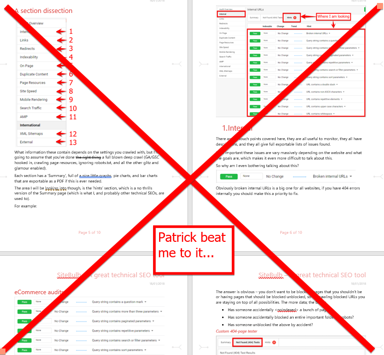
Note: there is already a great guides and recourses section.
So instead, I will cherry pick a few of my favourite features and ways they can be used (sometimes in conjunction with other tools), to technically enhance a website. Hopefully you’ll take away at least one useful pointer away from this article.
How to improve site speed
Site speed has always been important to users and has always been (rightly), labelled as a ranking factor for SEO, too. Now with Google’s recent announcement that mobile speed is a direct ranking factor it, has become more important than ever, thus bringing us to the site speed section of SiteBulb.
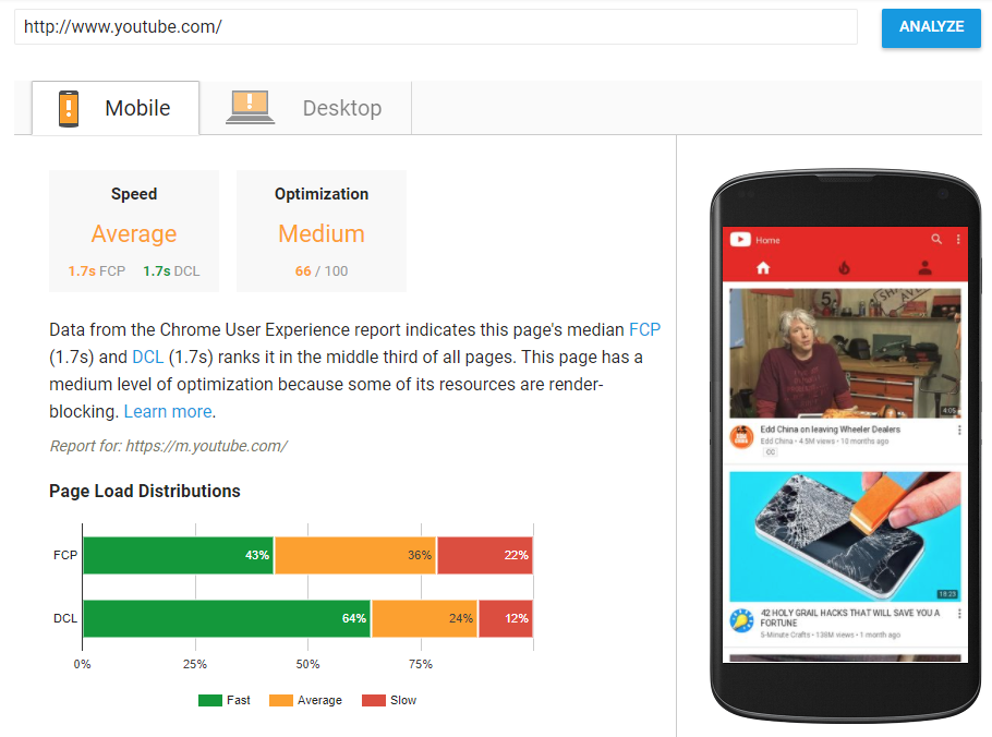
Warning: common sense should be used while making speed increase recommendations to developers, or you may end up in an ugly conversation.
SiteBulb has some ~30 ‘hints’ how to improve it, a lot of them are the usual ‘minify CSS’, ‘minify JS’, ‘use GZIP compression’ which are important quick wins to safely fire at developers.
The next ‘big thing’ everyone should be looking towards is moving to HTTP2, as this solves quite a few of common speed issues as it can handle a multiplex of requests (‘avoid too many X requests’).
Switching to HTTP2 can be as easy as flicking a switch if you own your own server, however, if you’re on shared hosting things become a bit more difficult because the control is not in your hands.
Why caching, JS, CSS, & images are important to speed
- Caching is talked about in a fair few areas, typically it recommends setting cache expiry herders to 30 days, so that regular users of your site do not have to re-download catchable content constantly, which is fair enough.
- JavaScript should only be used on pages where it’s required, for example, sometimes developers just ‘blanket code’ the entire JS code onto every single page of the site.A much better way to do this is to use a tool such as web pack in which you can specify what the barebones JS is needed across the website, then any additional JS can be added to these pages.
- CSS files can sometimes become incredibly large due to the developers using multiple CSS frameworks, bolting them together, and then not removing the parts that aren’t required.
- Critical rendering path is all about putting what needs to be loaded first above everything else, or ensuring render blocking synchronous JavaScript isn’t the first thing in your <body>. SiteBulb makes hints at ways this can be improved. In short, site speed is a very complex issue to tackle, and you should work closely with a developer who knows exactly what they’re talking about when attempting to improve it.
How to improve mobile friendliness
Slightly following suit from the above section, we’ll move into the mobile rendering feature.
This is the only section which doesn’t have a fancy dashboard, it’s just straight to the point and lists both good and bad points.
Note: it does say at the top that this is based on a sample of URLs, because doing this for every URL would take all eternity.
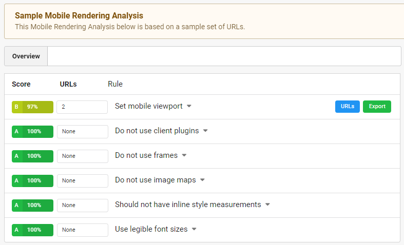
This isn’t surprising seeing as Google has a fantastic tool to test mobile friendliness, and inside your Google Search Console, any page that is indexed and has mobile friendliness issues will be flagged in the ‘Mobile Friendly’ section, and it will tell you precisely what’s wrong. That’s hard to beat, really.
SiteBulb is useful for bringing these things to your attention so that you can go off and check your Search Console to see if the issue is bigger than you thought.
However, let’s look at the unobvious:
- Do not use client plugins
“Avoid using client plugins, which do not work on mobile – Java applets, objects and embeds (e.g. Flash).”
This technology is deprecated, if you find your website is using it… Kill it with fire.
- Do not use frames
“Frames are typically unresponsive, so will not display correctly in an otherwise responsive framework.”
“Since the early 2000s, the use of framesets has increasingly been considered obsolete due to usability and accessibility concerns, and the feature has been removed from the HTML5 standard.” – Wikipedia
Frames are deprecated and not used. iFrames on the other hand, are not.
- Do not use image maps
“Image maps rely on hard coded coordinate data for each different link, which do not scale well in mobile browsers.”
Pretty rare these days… But an image map is essentially an image that contains multiple links depending on where you click on it.
Finally, something I have not yet tested is how this feature handles sites that still have separate mobile sites to desktop sites. I am assuming that you will have to crawl each version of the website separately.
Interesting trends to look for in organic search traffic
Note: you need to hook your GSC & GA into SiteBulb for this section to work
This section is very intriguing as it gives you stats that you wouldn’t normally think of, but make for great food for thought and further analysis ideas. For example (these are all for indexable URLs):
- Received no organic traffic from tablet/mobile/desktop/any device + Only has desktop organic search traffic
Do you notice any big discrepancies here? Are some URLs receiving 10x more/less traffic on mobile than on desktop? Or vice-versa? If so, this is very strange and there must be a reason for this – find out why.
Bear in mind Google’s mobile first index is slowly rolling out, and if one of your ‘big money pages’ is *only* receiving desktop traffic – it’s unclear what may happen here but well worth thinking about.
- Disallowed/forbidden URL received organic traffic
Forgetting pages such as ToS, T&Cs, and PPs – are any of the pages you’ve blocked search engines from indexing getting any traffic? If they are, this is utterly bizarre and is likely a bug somewhere.
- URL received search traffic but 0 goal conversions
Do you have pages receiving tonnes of traffic but are not converting? Have a sift through them and think about what can be done to convert users on these pages.
For example, if it’s a blog post, is it worth redirecting and recreating this as a real page on the website with a huge CTA next to it? We recently did this for a client and they’ve seen excellent results from the change.
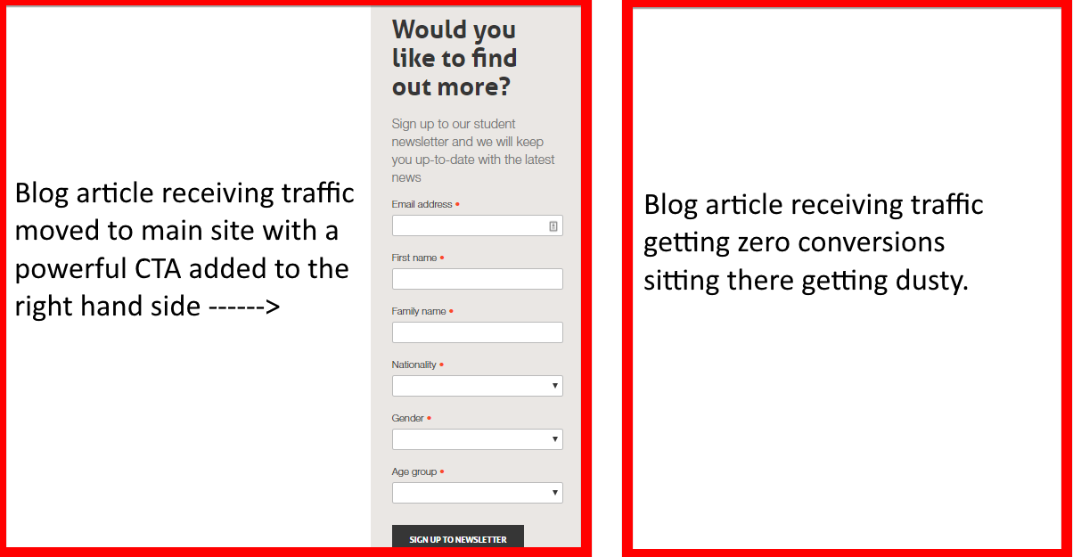
Another example, can you do targeted pop-ups on some of these pages that are attracting attention but not converting?
- 4XX/3XX received organic traffic
If you see anything here, especially in the 4XX section, you should fix that page immediately! This may be fixed with a 301 redirect, which is kind of an oxymoron as this is another ‘advisory flag’ to look out for, but in this case, it is much better than users landing on dead pages on your website.
SiteBulb’s fully interactive Crawl Map
One of my favourite and fanciest features of SiteBulb — the Crawl Map. Visualizing your website’s architecture used to be a nightmare, in the past I’ve used a combination of tools that spat out something that looked like a Rorschach test — this is not the case with SiteBulb though.
Behold, the ultimate interactive visualization of your website’s architecture:

You can muse over every node and see exactly how many links are pointing to each page, how many are stemming off it, and ultimately how all that sweet link equity will trickle through your carefully crafted funnel.
Other features that SiteBulb offers
- Excellent support
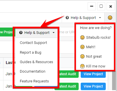
Simply say ‘Okay Patrick’ into a mic whilst SiteBulb is open and he will answer any question you have almost immediately, and go above and beyond to assist you.
Disclaimer: there is no voice ‘Q&A’ implemented yet.
- Audit comparison
Perhaps my favourite feature of all, SiteBulb saves every audit you do of a website and you can compare them against any of version of itself, the display for this is as simple as it gets with the data of each audit side by side in a column and the % that has changed.
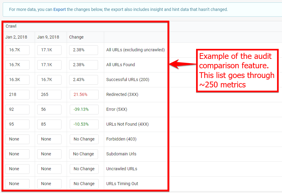
You can easily export this data and create your own dashboard, keep a history of all your website’s data, and create some sort of process to check changes weekly, monthly, or YoY reports.
- All data is exportable into a PDF or spreadsheet
This is self-explanatory, but as far as I’m aware every single section of the audit is exportable as a PDF or a spreadsheet. The PDFs are well laid out with easy to understand graphs, charts, and annotations. The spreadsheets contain just the raw data that is great to drill down into yourself.
- Advanced crawler configuration
Anything Screaming Frog can do (and more?):
Respect robots, exclude certain folders, JS crawler (or not), User Agent switcher, proxy support, crawl depth limiter, URLs per second limiter, and so much more.
Conclusion
As I’ve read somewhere else, this is a ‘great SEO Swiss army knife to have in your tool box’.
It touches upon every important SEO related area, and steers your attention to places that need further investigation. It highlights points that you may have forgotten about, and areas that you may never have heard of, but it has an explanation of everything metric it measures.
I can only see this tool going from strength to strength as the people who made SiteBulb actually care and are constantly updating and improving the software. They listen to users and take feedback onboard — which is very rare, but ultimately very good.