The 404 page is a fairly common sight for most internet users. At some point, we’ve all clicked a link or visited a web page, only to be presented with a message that what we were looking for is unavailable.
However a user ends up at a 404 error page, the important thing is how you handle that message. Done badly, the 404 page can signal a dead end in that user’s journey, leading to them looking elsewhere for solutions. But they’re also, in many cases, unavoidable. So what do you do?
While often overlooked, a well-crafted 404 page can actually enhance user experience (UX), keep visitors on your site, direct them to the most relevant page, and even indirectly support SEO by reducing bounce rates. But that all means creating effective 404 pages that serve a purpose. They have to not only look good, but also easily and clearly guide users towards the solutions they’re looking for to minimise friction.
Let’s dive a little deeper into the ominous 404 page and explore what you can do to ensure yours serves a purpose and aids performance.
What is a 404 page?
Error code 404 is one of the most commonly recognised HTTP status codes. When a server returns a 404, it means the page cannot be found. This usually happens when a user enters an incorrect URL or clicks a broken link. When this error occurs, the user is served a page that explains the issue.
The harsh reality is this — a 404 page is a moment of failure in the user journey. But it’s how you respond to that moment that matters. Left unmanaged or handled poorly, 404 pages create dead ends and lead to frustration. Users land on a page that offers no direction, no recovery path, and no reason to continue. As a result, they leave your site.
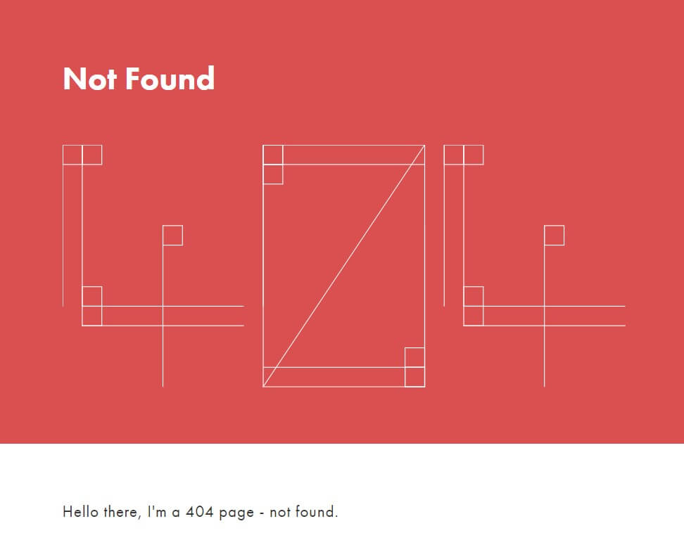
SALT.agency 404 page
However, when handled effectively, a 404 page becomes a controlled recovery point. It acknowledges the issue, maintains trust, and redirects attention back to relevant, high-value areas of the site.
From a search perspective, the fundamentals still apply too. For SEO purposes,, ensuring 404 pages return the correct HTTP status code is essential. “Soft 404s” can confuse search engines and hurt rankings. But beyond that, the real impact is behavioural. Poor 404 experiences contribute to weaker engagement signals, which over time can influence organic performance.
404 page SEO best practices
There’s a tendency to overcomplicate 404 pages from an SEO standpoint. In reality, the principles are straightforward, but execution is where most sites fall short.
It all starts with clarity. Users should immediately understand why the page they’re looking for isn’t available without needing to interpret technical language. From there, you need to ensure consistency. Using a design consistent with your brand makes the experience feel intentional instead of broken. If a 404 page looks disconnected from the rest of the site, it undermines trust at exactly the wrong moment.
The most important factor, however, is what happens next. You’ve served a user an error notification. But where do they go next?
Navigation and search functionality is what turns a 404 from a dead end into a continuation point. Without it, even the best-designed page will fail. You need to give your user the option to search, click through to related content, or navigate via a menu of options to find what they’re looking for.
There are also some common missteps worth avoiding. Redirecting all 404s to the homepage, for example, might seem like a quick fix, but it creates confusion for users, means journeys are dropped, and can lead to soft 404 issues in search engines. A clean 404 response, supported by strong UX, is always the better approach.
Ongoing monitoring is equally important. Broken links are inevitable — particularly on large or evolving sites. What matters is how quickly they’re identified and addressed.
Designing 404 pages for better User Experience
Creating a high-performing 404 page is ultimately a UX challenge. A good 404 page keeps users engaged and prevents frustration. And that all starts with achieving the right tone of voice. The best 404 pages use simple, human language to explain the issue, removing ambiguity and reducing friction, while still feeling like part of the journey by retaining your brand’s voice.
Branding also has a role to play here. Using a branded design on your 404 page helps maintain continuity and ensures users don’t feel like they’ve fallen out of the site experience and onto a generic error page.
Where some brands do go wrong is prioritising creativity over usability. Visual elements, humour, or interactive components can be effective, but only when they support the primary goal — helping users recover and continue their journey. That’s where helpful navigation becomes the defining feature. Whether it’s a search bar or key category links, the page should actively guide users back into meaningful journeys.
Implementing and managing 404 pages
While implementation of a 404 page does vary depending on the platform (more on that later), the strategic requirements generally don’t. The objective is the same — create a 404 page that feels like a seamless extension of the site, not an afterthought.
Always validate how your 404 page performs across devices. Navigation, search, and interaction points need to work as effectively on mobile as they do on desktop — anything less introduces unnecessary drop-off.
Beyond implementation, maintenance is where long-term value is realised. Monitoring 404 errors, identifying patterns, and resolving underlying issues ensures that these pages remain a fallback — not a frequent destination.
Of course, the way you set up a 404 page is a little different depending where you do it. Let’s take a look at best practice across a few different platforms.
WordPress
WordPress has a number of options for handling 404 pages. You can take your pick from the handful of 404 redirect plugins that are available through the CMS.
For creating your own 404 page, you can either use another plugin or use a page builder like Elementor to add custom error pages. The other option is to copy the 404.php file from a chosen theme and modify it in Theme File Editor.
Shopify
If you want to redirect a 404 page on Shopify, go to Sales Channels > Online Store > Navigation > URL Redirects. You’re then given the option to redirect an old URL to a new one.
To create custom 404 pages, you can edit a copy of your site theme layout file, adjust and remove elements as you like and link it to the 404 template. You can also upload an image to the platform, and add the URI to the CSS in the 404 template. Shopify has detailed instructions on how to do this, as well as how to add other elements to the page.
SAP Hybris
If your website uses SAP Hybris, dealing with 404s is slightly more complicated. Unlike WordPress and Shopify, you’ll have to configure the code yourself. To add a redirect, you must create a file with directives written in Apache syntax and add it to the Filtering and Redirects of your Endpoint page. To create a custom error page, you need to build it in the web.xml file.
Salesforce Commerce Cloud
For redirects on Salesforce Commerce Cloud, all you need to do is go to Merchant Tools > SEO > URL Redirects and select New. Salesforce also makes custom 404 pages a little easier than SAP Hybris. It’s a case of going into Business Manager and navigating through Administration > Site Development > Custom Error Pages. You can then download a .zip file with all the error pages, customise the 404 page, and re-upload.
404 page examples: What works and what doesn’t
The gap between effective and ineffective 404 pages is rarely about effort — it’s about focus of priority, and that priority should be the user’s recovery.
Some brands may choose a more playful approach that is visually engaging. Others may favour functionality over style. Both approaches succeed because they prioritise user recovery.
Where things break down is when that priority is missing. Generic corporate 404 pages, for example, often provide little more than an error message, sometimes paired with a vague redirect. There’s no guidance, no context, and no clear next step, which ultimately loses the user and can lead to them leaving the site, potentially never to return.
For eCommerce sites, the impact is even more immediate. A 404 page without product links offering a next step, search functionality to offer an alternative option, or category navigation frustrates users and interrupts potential revenue.
Ultimately, a 404 page should be judged on what it enables users to do next, not how it looks in isolation. But if functionality pairs nicely with engaging visuals, that’s even better.
But who does it best in a world of different 404 pages? Here are just a few of our favourites.
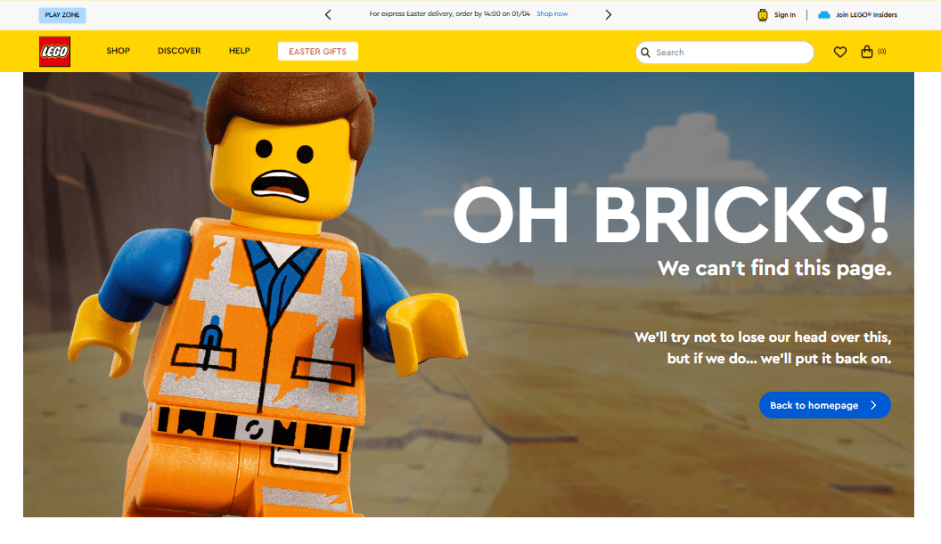
LEGO: On-brand creativity that supports user recovery
LEGO’s 404 page demonstrates how to balance creativity with usability. The use of a playful, on-brand visuals paired with casual, human language is exactly what you want to see on a 404 page. The page leans into LEGO’s identity, featuring a recognisable LEGO minifigure and light humour, which helps soften the frustration of encountering an error.
What makes it particularly effective, however, is that the creativity doesn’t come at the expense of functionality. The messaging is clear, and users are quickly guided back to relevant areas of the site. They can either follow the clearly marked ‘Back to homepage’ button or search for something directly in the navigation bar at the top of the page. This combination of brand personality and practical navigation is what turns the page from a novelty into a genuinely useful UX touchpoint.
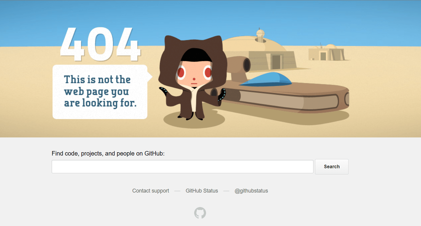
GitHub: Functional simplicity for a technical audience
A strong example of knowing your audience and designing accordingly is GitHub. Its 404 page combines a witty reference with clear links and an easy search function, delivering exactly what users need without unnecessary distraction.
The strength of GitHub’s approach lies in its restraint. Rather than overloading the page with more creative elements than necessary, it prioritises clarity and recovery. For a developer audience, this is critical — users don’t need hand-holding, they need efficiency. By providing routes back to the homepage, support pages, and to easily search, GitHub ensures that even in error, the experience remains seamless and purposeful.
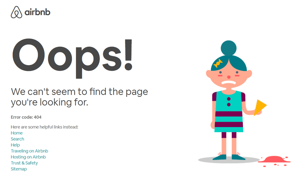
Airbnb: Turning friction into engagement
Airbnb’s 404 page is one of the best modern examples due to its use of subtle animation and thoughtful UX design. The page features a simple animated moment that mirrors the idea of something going wrong, making the experience feel relatable rather than frustrating.
What elevates Airbnb’s approach is how it pairs this visual element with strong usability fundamentals. Users are given immediate access to key navigation options such as search, homepage, and helpful links, allowing them to quickly recover their journey and find a relevant alternative, no matter where they were before the error. The animation adds personality, but the real value lies in how effectively the page redirects attention back to high-intent actions.
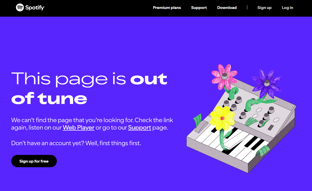
Spotify: Minimal friction with a focus on user intent
Keeping it clean and easy, with a touch of personality, the Spotify 404 page demonstrates how a simple, stripped-back approach can still deliver a strong user experience. “This page is out of tune” is a fun play-on-words for a 404 page on a music streaming site that all users will instantly understand. It uses light humour alongside simple navigation to guide users back to the platform’s core functionality.
What makes Spotify’s execution effective is its focus on user intent. Visitors typically arrive with a specific goal — listening to music, finding an artist, or exploring playlists — so the 404 page quickly redirects them back into those journeys. Rather than overloading the page with content or overly creative elements, Spotify keeps the experience clean and functional.
This approach works particularly well for high-frequency, task-driven platforms. By reducing friction and prioritising speed, Spotify ensures that even when something goes wrong, users can recover almost instantly. It’s a strong reminder that for many brands, simplicity and clarity will outperform more elaborate designs.
Turning 404 errors into opportunities
404 pages are often treated as a technical necessity. In reality, they’re a strategic touchpoint.
A well-designed 404 page is an opportunity to engage users, strengthen your brand, and guide visitors to relevant content. When handled well, they reduce friction, support engagement, and contribute to a more resilient user journey. Handled poorly, they do the opposite, quietly undermining performance at scale. For most sites, the opportunity isn’t to create something clever. It’s to create something effective. And that’s where the difference is made.
As experts in technical SEO, we know a thing or two about 404 error pages and beyond. Reach out today so we can help you take your 404 from a dead-end to an international pathway.
The biggest referrer to your content might never show up in your Analytics platform. Let that sink in for a minute. It’s a problem for businesses who need visibility in AI search, and let’s face it, that’s everybody. Right now, if ChatGPT, Claude or other AI assistants quotes your blog post in a live answer, […]
A year ago, ChatGPT disrupted our lives and processes. With it, countless AI tools quickly followed suit and became more accessible to the general public. Search engines are now beginning to introduce a plethora of AI-powered search tools. As businesses, we need to be prepared for how users will adopt these new technologies and how […]
The 404 page is a fairly common sight for most internet users. At some point, we’ve all clicked a link or visited a web page, only to be presented with a message that what we were looking for is unavailable. However a user ends up at a 404 error page, the important thing is how […]