Common web design mistakes that can affect SEO
As the web evolves, so do search engines.
Web design has become more immersive and exciting, and people can interact with content online in ways that were never possible 10 years ago. With this continued evolution, how your user experiences your content is almost as important as the content itself. Search engines have also evolved ranking criteria directly related to user experience.
There are some common web design elements and ways of displaying content that developers, designers, and business owners like to add to their websites to convey their brand messaging. However, some of these changes can have more of an impact on SEO than you might think.
In this article, we’ll explore specific design changes, how they can be damaging to SEO, and what you can do to make the design choices you want in a search engine-friendly way.
Specific Design Changes & Their Potential Impact on SEO
Placing Content Behind Tabs
Adding content elements such as tabs or accordions is a good way to add interactivity to your user journey and keep people engaged with your content. When users can navigate their way through elements that are split into logical sections, they can interact with sections that are relevant to them.
The below example shows how UCAs have used tabs for their FAQ content, which the user can easily navigate without having to scroll through all the content that’s hidden behind the other tabs:
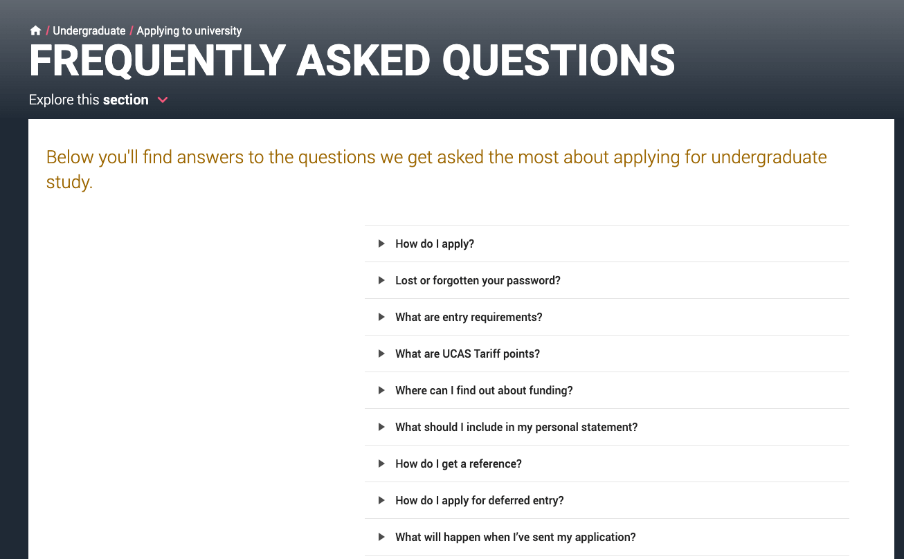
However, there is a question as to whether serving content in this way has an impact on SEO, as the content is essentially hidden behind tabs.
Luckily, search engines such as Google are capable of crawling content that is hidden behind tabs or accordions, so long as those navigational elements are accessible within the HTML.
It’s worth noting that Google’s Webmaster Guidelines specifically state that content placed behind expanding sections is treated as less accessible than the rest of the content on the page. It’s important to ensure your most important content is visible and accessible and save using tabs or accordions for less important information such as FAQs, transcripts or user reviews.
Confusing or Under Optimised Website Navigation
Your website navigation menus are a pivotal part of your user’s journey through your website.
It’s a common misconception that your URL structure is used by Google to understand your site hierarchy from the most important to the least important page. Search engines actually pay attention to the way your pages are linked to throughout the website to understand site hierarchy and structure. Your navigation menus play a key role in establishing this.
Your main menu is the primary way crawlers will find and access your content, which should be taken into consideration when designing your website navigation menu. This can become particularly important for eCommerce websites that tend to have more extensive and complicated main menu structures.
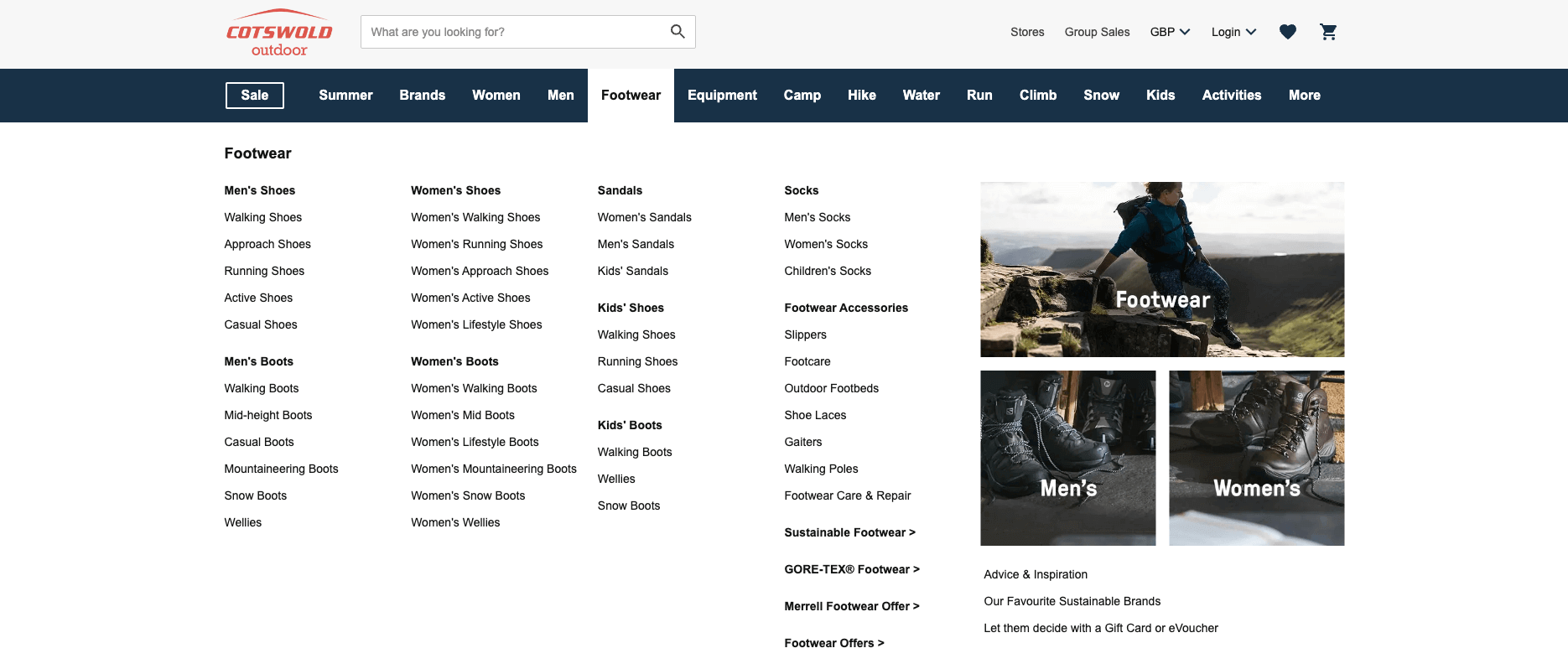
Below is an example of a good website menu hierarchy and structure on Cotswold Outdoor. Each item is categorised and subcategorised, and the links have descriptive anchors to help users and search engines understand where each link will take them:
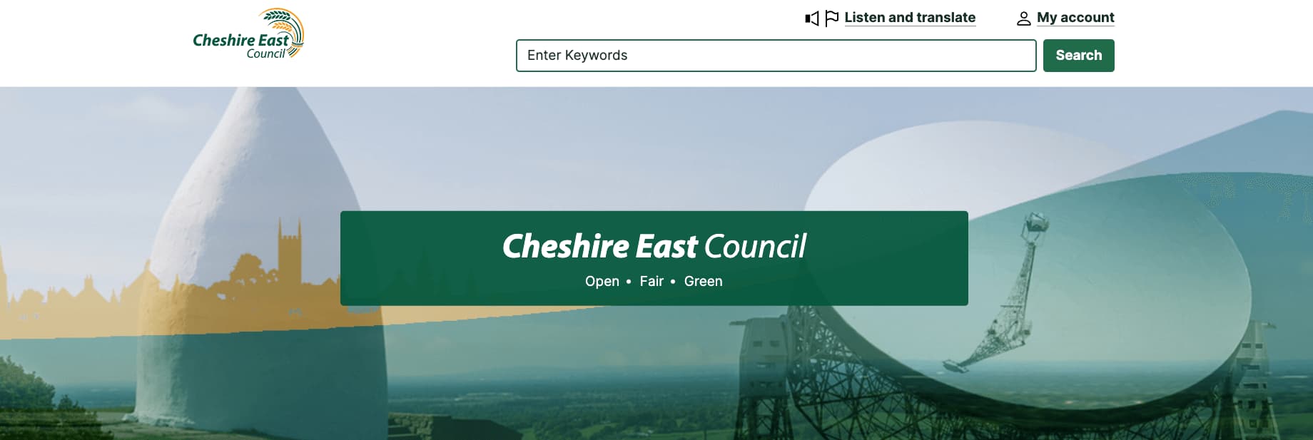
By contrast, the Cheshire East Council website could improve its site structure by adding a dropdown menu. This would help users and search engines find pages more easily as opposed to the use of a search bar, which is much less helpful for users and search engines:
Infinite Scroll
Infinite scrolling is the process of loading more page content as users reach the bottom of the page. JavaScript is used to inject this content continuously the further down you scroll. It’s commonly implemented on News websites or content hub pages.
Search engine crawlers, such as Googlebot, cannot scroll through pages. When a crawler does land on a page, it can only crawl what is visible. Depending on how your infinite scroll is implemented and how it’s visible in the rendered HTML, this can cause indexing problems. It’s possible that search engines will miss all the content that is hidden behind the scroll.
If infinite scrolling is key to your design, it’s important to understand how to implement this in a way that is search engine-friendly. The best way to do this is to create a paginated version of each section, meaning that each component will have its own page that can be accessed with a unique URL. The general practice for pagination is to include a parameterised URL indicating the page number such as below:
- https://www.example.com/news?page=2
- https://www.example.com/news?page=3
John Mueller created an infinite scroll with pagination demo to illustrate the correct way to serve this design element. When working this into your web design, be sure to read Google’s developer guidelines on correct implementation.
Adding Text to Images Instead of Content
A common mistake web designers or businesses make is adding written content to images. By this, we mean when the written text has been implemented on the image file itself through tools like Canva and Photoshop.
One of the biggest issues with adding text to images in your designs is that it is neither accessible nor responsive. This means that, for users who use screenreaders or plain text browsers, it will be impossible for them to interpret the writing in the image. Similarly, on smaller devices, it won’t be possible to make the font size responsive and can end up being illegible.
The SEO impact of this is that Google and other search engines aren’t able to crawl and understand the content within image files, meaning any text on images cannot be interpreted and used to rank your content.
In the below example, you can see how Safe Style uses images with text edited into them to display their offers and finance options. You can see that the “GET FREE QUOTE” button is also part of the image, which will make it difficult for search engines to understand where the image links through to:

Instead, web designers should opt for using HTML and CSS to implement text and buttons over images, such as how Canyon have implemented their content and CTAs in the below example:
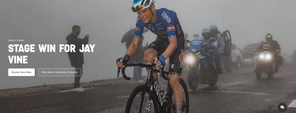
There are some exceptions to this rule. For example, if you are including a screenshot to illustrate something, there are instances where text will naturally be included in these screenshots (such as in this article). In this instance, it’s best to add descriptive alt text so that both search engines and users with accessibility needs can understand what the contents of the image are.
Intrusive Pop-ups and Interstitials
Most people would agree that landing on a website to find an answer to a question only to be greeted with a huge popup is frustrating, and Google certainly thinks so too. In 2017, Google stated that websites with intrusive content like this could be ranked lower than those offering better user experiences.
Intrusive interstitials are essentially large pop-ups that obscure the entire content of a page. Often they are advertisements and can be difficult to dismiss, which leads to a bad experience for users across all devices. Below, you can see an illustration of what intrusive interstitials tend to look like:
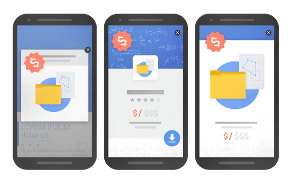
Google’s documentation on this states:
Intrusive dialogs and interstitials make it hard for Google and other search engines to understand your content, which may lead to poor search performance. Equally, if users find your site hard to use, they are unlikely to want to visit those websites again, including through search engines.
Despite this, if including a popup in your design is absolutely necessary, there are ways to do so without being intrusive. Opting to use smaller, dismissable banners that only take up a small portion of the screen and don’t interfere with the user’s interaction with the rest of the page content is an appropriate alternative.
You can also opt to show an easily dismissable interstitial at a later point that isn’t at the moment the page loads. For example, when a user navigates to another page or after they’ve had a chance to digest the page content first.
How Web Design Impacts SEO
In most cases, it’s possible to achieve the design elements you want on your website, so long as they are implemented in the right way and with your users and search engines in mind. Ultimately, Google wants to serve the best results to its users in the same way that you want to deliver great experiences and designs to yours.
Working SEO into every part of your web design process is ultimately the best way to prevent traffic drops or SEO issues as a result of making web design changes. Hopefully, this article has provided you with some insight into how specific changes can impact your search performance.