Analysing website traffic based on days of the week with Python
If you hope to understand traffic patterns and its fluctuations, a thorough analysis is crucial. Unfortunately, a limitation of tools like Google Search Console (GSC) is that you can’t analyse traffic based on a specific day of the week.
Sites can identify a trend in their traffic based on each day of the week but can’t dive into the details to understand the fluctuations. This is a big drawback for online businesses looking to capitalise on refined targeting.
Join us as we explore a Python-based approach to visualise each day of the week’s traffic so you can uncover trends and gain a deeper understanding of your website traffic.
Getting Started
If you know the basics of Python, you will likely understand the following codes and be able to modify what we have for your benefit. For those who don’t know Python, don’t worry — you can copy and paste the codes to get the visualisations and charts.
To run the below codes, you can use Microsoft Visual Studio Code with Python and Jupyter extension or the JetBrains PyCharm IDE or Jupyter itself.
For the whole process, we need to use these third-party Python libraries:
- Pandas
- Plotly
- Kaleido
To install the above libraries, you can run the command below in a Jupyter cell:
!pip3 install pandas plotly kaleido
Also, we will import the following standard Python libraries:
- Datetime
- OS
from datetime import datetime

import os

import pandas as pd

import plotly.graph_objects as go

import plotly.io as pio

from plotly.subplots import make_subplots

import kaleido
Step 1: Download the Google Search Console data
Export the “Performance on Search Result” report from GSC to analyse the data based on the Python code. Consider setting the date to the past 16 months.
After pressing the Export button, select “Download CSV” to get a ZIP file that contains all of the “Performance on Search Result” section data in CSVs.

Next, unzip the downloaded file and move the “Dates.csv” file into the folder where you created your Jupyter notebook.
df = pd.read_csv('Dates.csv')
Step 2: Convert dates into days
There are five columns in the exported GSC file, which are “Date”, “Clicks”, “Impressions”, “CTR”, and “Position”. Add a new column named “Day of Week” which, based on the “Date” column, determines the date for which day of the week.
df['Day of Week'] = df['Date'].apply(

lambda date: datetime.strptime(date, '%Y-%m-%d').strftime('%A')

)
Step 3: Filtering the start and end of weeks
At this step, you must clean up the data. Ensure the start date of this CSV file is Monday and the end day of this CSV file is Sunday. Checking this and removing the data that doesn’t comply with this rule ensures X data points for each day of the week. For example, X + 1 data points for Monday and X – 1 for Sunday.
df['Date'] = pd.to_datetime(df['Date'])

date_min = df['Date'].min()

date_max = df['Date'].max()

date_start = date_min + timedelta(days=(0 - date_min.weekday() + 7) % 7)

date_end = date_max - timedelta(days=date_max.weekday() + 1)

df = df[

(df['Date'] >= date_start) &

(df['Date'] <= date_end)

].sort_values(by='Date').reset_index(drop=True)
Once the data is cleaned, the Pandas DataFrame should look like this:

Step 4: Plot line chart for each day of the week
You can now plot charts based on the clean data in different ways and with different libraries, such as Plotly.
Consider the below charts as examples in which you may want to blend the GSC cleaned data with your conversion rate data from Google Analytics (GA).
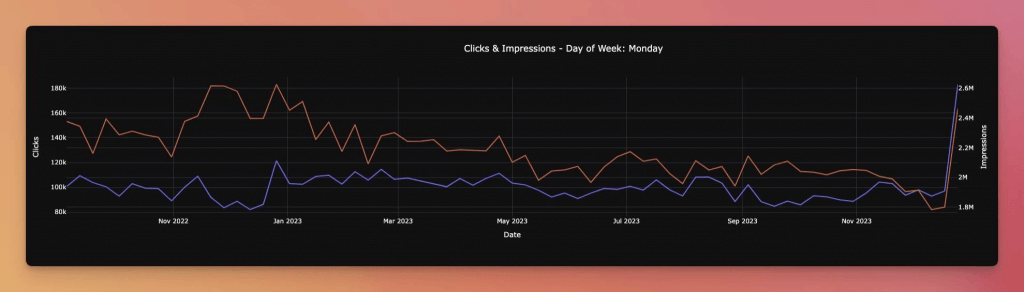
First, create a Python function that takes the day of the week as a parameter. Then, based on the day of the week, it will filter the data, retrieve clicks and impressions for this day of the week, and then plot it.
def plot(day_of_week: str):

fig = make_subplots(specs=[

[{'secondary_y': True}]

])

fig.add_trace(

go.Scatter(

x=df[df['Day of Week'] == day_of_week]['Date'],

y=df[df['Day of Week'] == day_of_week]['Clicks'],

mode='lines',

name='Clicks'

),

secondary_y=False

)

fig.add_trace(

go.Scatter(

x=df[df['Day of Week'] == day_of_week]['Date'],

y=df[df['Day of Week'] == day_of_week]['Impressions'],

mode='lines',

name='Impressions',

),

secondary_y=True

)

fig.update_layout(

title={

'text': f'Clicks & Impressions - Day of Week: {day_of_week}',

'x':0.5,

},

xaxis_title='Date',

yaxis=dict(title='Clicks'),

yaxis2=dict(title='Impressions', overlaying='y', side='right'),

)

fig.write_image(f'{day_of_week}.png')

# If you'd like to see the chart without saving it, comment the above line, and uncomment the below line.

# fig.show()
The chart is needed for all seven days of the week. The code below loops over all weeks and creates a chart for each.
# Create a folder to save plots in it

if not os.path.exists('./output-plots'):

os.mkdir('./output-plots')

# Set width and height of the output plots

pio.kaleido.scope.default_width = 2000

pio.kaleido.scope.default_height = 800

# Create a plot for each day of the week

for d in list(df['Day of Week'].unique()):

plot(d)
Step 5: Plot line chart to compare clicks and impressions
In the above section, we explained how to create separate charts for each day of the week and save them in the “output” folder. We will now create a line chart based on each day’s clicks to better visualize each day of the week’s clicks in comparison to the others.
fig = go.Figure()

for day in ['Monday', 'Tuesday', 'Wednesday', 'Thursday', 'Friday', 'Saturday', 'Sunday']:

day_data = df[df['Day of Week'] == day]

fig.add_trace(go.Scatter(

y=day_data['Clicks'],

mode='lines',

name=day

))

# Update the layout

fig.update_layout(

title='Clicks by Day of Week',

yaxis_title='Clicks',

legend_title_text='Day of Week',

xaxis_visible=False,

xaxis_showticklabels=False

)

fig.write_image('Clicks comparison.png')
Below is the code for getting comparisons based on impressions:

fig = go.Figure()

for day in ['Monday', 'Tuesday', 'Wednesday', 'Thursday', 'Friday', 'Saturday', 'Sunday']:

day_data = df[df['Day of Week'] == day]

fig.add_trace(go.Scatter(

y=day_data['Impressions'],

mode='lines',

name=day

))

# Update the layout

fig.update_layout(

title='Impressions by Day of Week',

yaxis_title='Impressions',

legend_title_text='Day of Week',

xaxis_visible=False,

xaxis_showticklabels=False

)

fig.write_image('Impressions comparison.png')
Step 6: Plot line chart to compare clicks and impressions median
In the above charts, we can observe that finding the trends is hard. To make a better sense of the trend for each day compared to other days, we will create charts based on the median of the data.
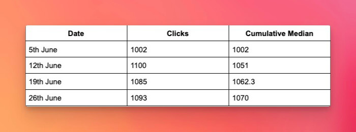
fig = go.Figure()

for day in ['Monday', 'Tuesday', 'Wednesday', 'Thursday', 'Friday', 'Saturday', 'Sunday']:

fig.add_trace(go.Scatter(

y=df[df['Day of Week'] == day]['Clicks'].expanding().median(),

mode='lines',

name=day

))

# Update the layout

fig.update_layout(

title='Clicks Median by Day of Week',

yaxis_title='Clicks Median',

legend_title_text='Day of Week',

xaxis_visible=False,

xaxis_showticklabels=False

)

fig.write_image('Clicks medain.png')
Below is the code for plotting the impressions:

fig = go.Figure()

for day in ['Monday', 'Tuesday', 'Wednesday', 'Thursday', 'Friday', 'Saturday', 'Sunday']:

fig.add_trace(go.Scatter(

y=df[df['Day of Week'] == day]['Impressions'].expanding().median(),

mode='lines',

name=day

))

# Update the layout

fig.update_layout(

title='Impressions Median by Day of Week',

yaxis_title='Impressions Median',

legend_title_text='Day of Week',

xaxis_visible=False,

xaxis_showticklabels=False

)

fig.write_image('Impressions median.png')
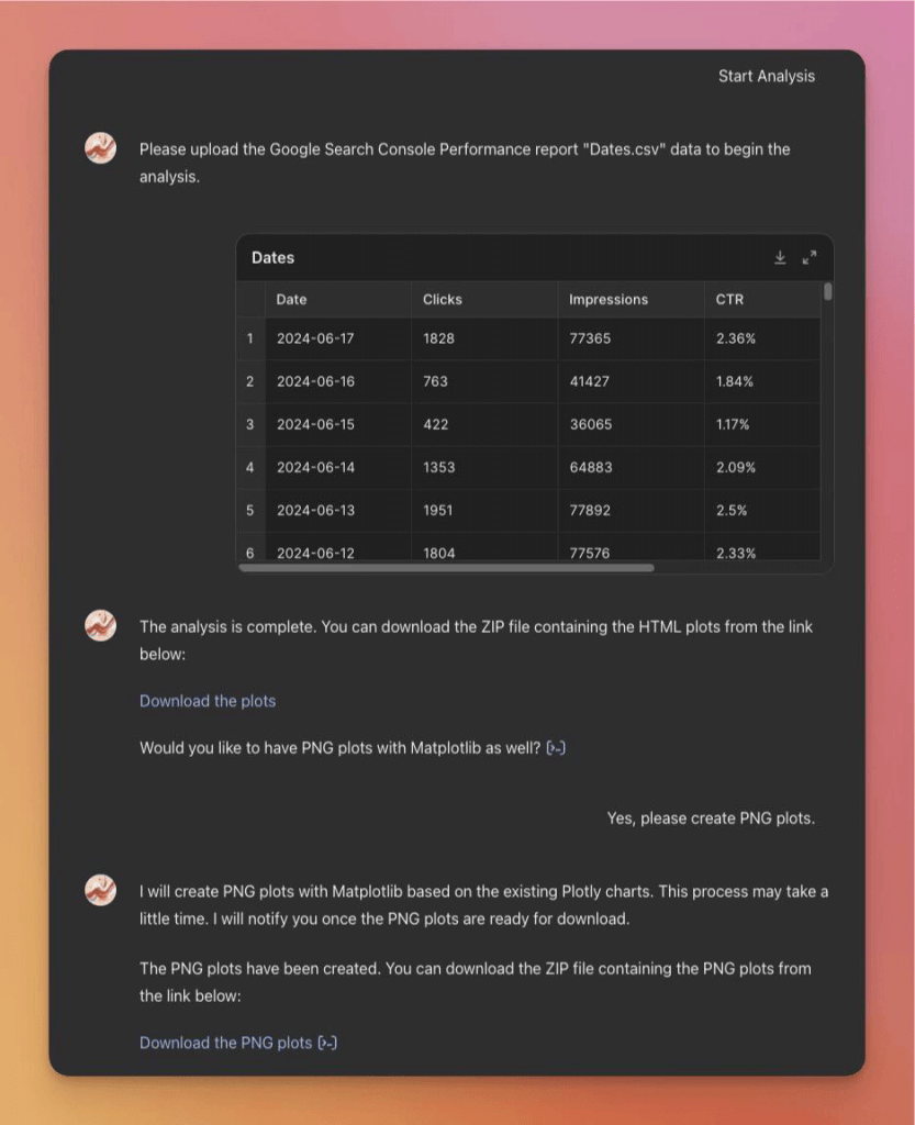
GSC performance analysis based on days of the Week GPT
If you’d like to analyze your data without coding, you can use the “GSC Performance Analysis based on Days of the Week GPT“. This GPT enables you to easily upload your Dates.csv file and automatically generate the charts mentioned above.
Google Search Console API integration
There are infinite possibilities to use GSC API in the automation pipeline and schedule a code snippet to run at certain times. You can consider integrating the above code into your pipeline and receive fresh data via email or a Slack message each week or month.
Remember, this analysis isn’t limited to Google Search Console data. You can use it to analyze your different traffic sources’ data and gain insight at a marketing level, not only at an SEO level.


