Breaking down leads by location
Knowing the physical location of where your website’s leads are coming from is useful knowledge to have, and there are many ways to find this out, just as there are equally many ways you can interpret the data.
In this article I will cover a few ways you can gather location data and display it in a digestible form.
Gathering the data
The examples I will be using are from websites that target the UK and the local areas within it, but these methods can be applied to websites that target multiple countries.
Google analytics
In GA navigate to Audience > Geo > Location and set the time period to 12 months to get a decent sized overview.
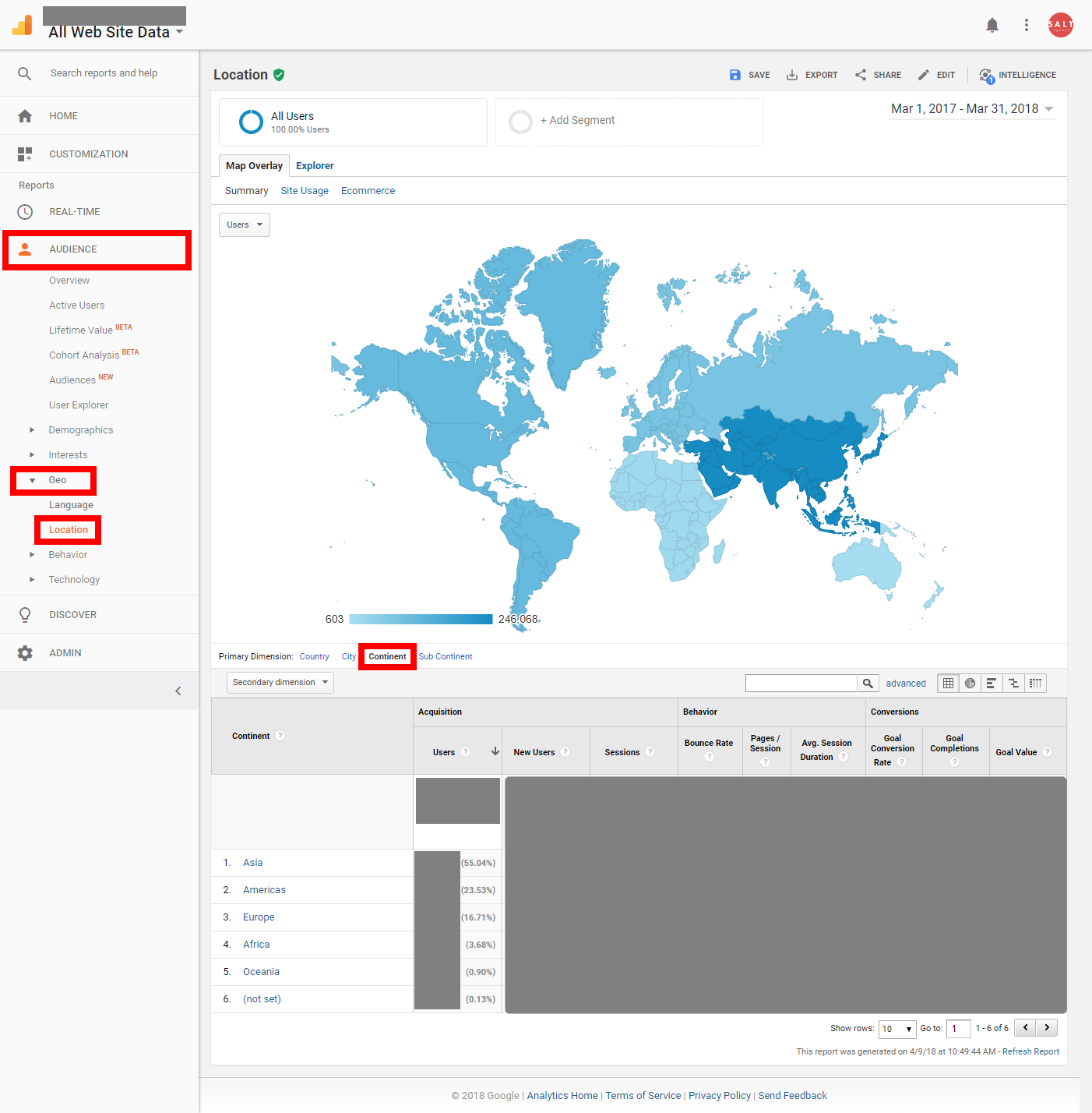
At a very top level, you can view users and goals by continent, this is more useful for international websites.
If you mouseover, it tells you more data about that continent and you can drill down into sub continents, country, and cities.
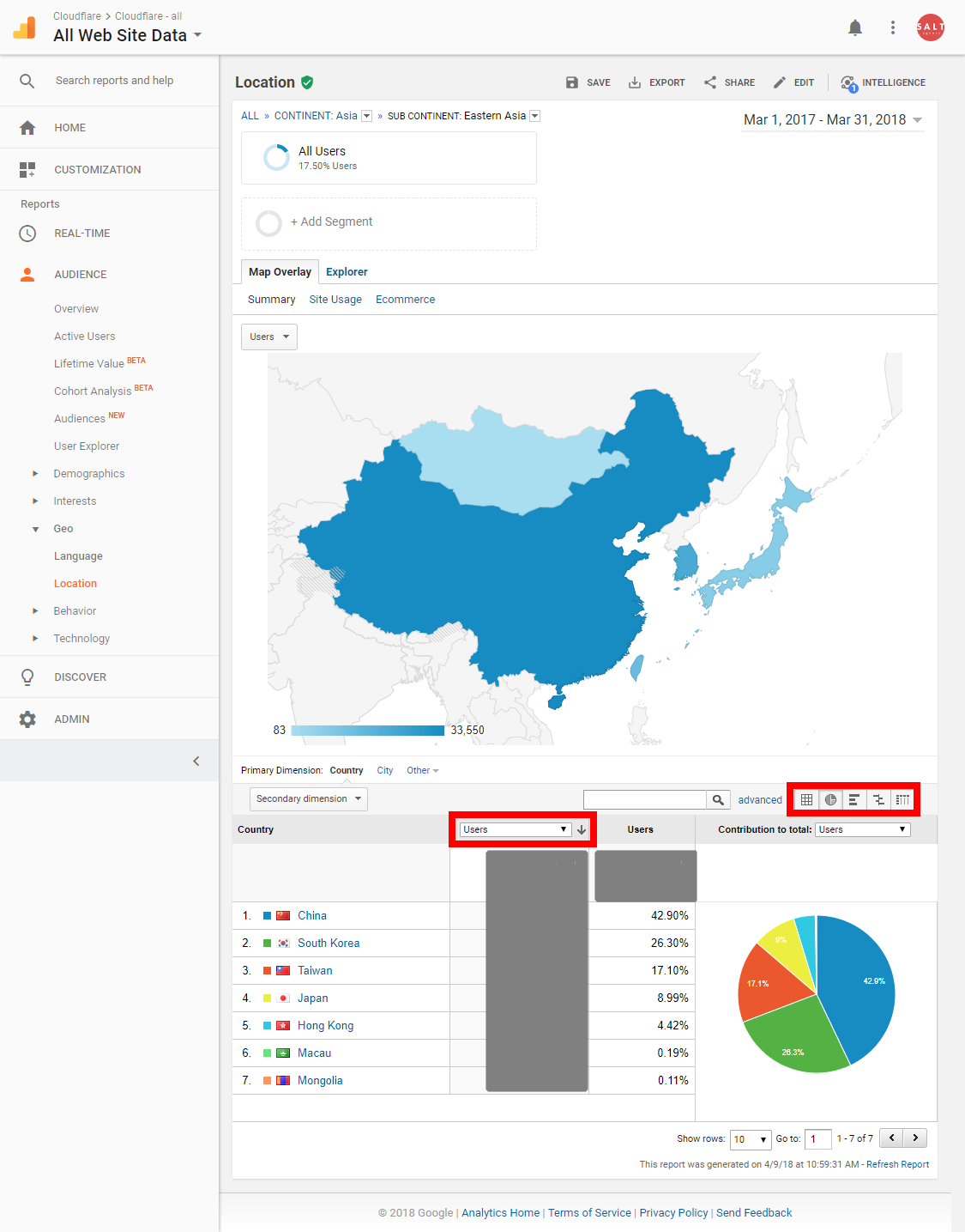
While drilling down, you can choose a bunch of different options to analyse the data, such as the number of users or goals, and how to display the data in the form of a pie chart, comparison graph, the raw data table, and more.
A local UK website
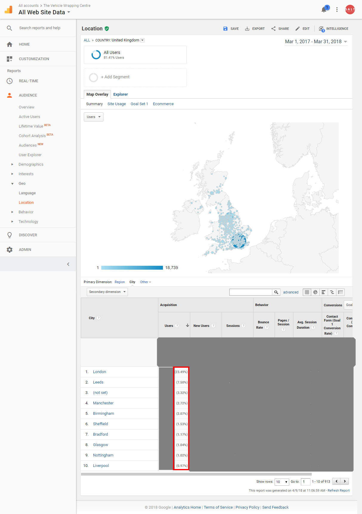
Data can become a little less useful in Google Analytics if you are trying to do this for a website that targets only a single country.
In the above screenshot, you can see that 23% of users come from London (and roughly the same amount of goals), but in actual fact, I know this to be not the case.
The hyper local data is not 100% accurate because users’ IP addresses are not always indicative of their physical location, and this is how user geo data is collected in Google Analytics.
This is becoming the case more and more often these days, so I would not use the hyper local data from Google Analytics as a reflection of your geo demographic.
Nonetheless, you can still use this tool to get a quick overlook of roughly what’s happening on a country level.
Google Search Console
Export all search queries from the new Google Search Console for the past 12 months and sort them in an A-Z format to make it easier to spot queries with a location appended to them, i.e. ‘SEO Brighton’.
You can use a formula to make this easier which search for words in specific strings (queries) and adds them up:
=COUNTIF(range,”*text to search for*”)
=COUNTIF(B4:B11,”*a*”)
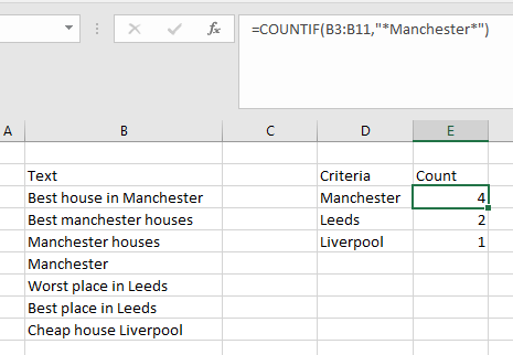
However, when using this method, I recommend doing it manually also to account for typos and the different terms people use to search for an area.
Contact forms on the website
This is the most valuable and accurate of all the methods.
If your website has a contact form and you request the user to submit their postcode (meaning they are already high in the conversion funnel), you can paint an accurate picture of physical locations.
Like above, you can sort this data alphabetically and use a formula to count how many times a certain postcode appears (the first half of it is the most important as this contains the information about the area).
You can simply Google each postcode and it will tell you the area that this covers, and you can create an additional column and map and add each postcode to it.
Making sense of the data
Once you have collected your data, ideally from postcode contact form submissions, there are numerous ways to visualize and comprehend this data.
Simple excel pie chart
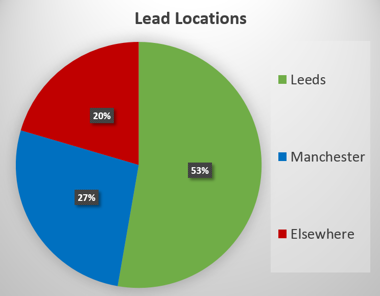
From your data that you have processed from either GA, GSC, or a contact form, you can create a simple chart and graph to show a breakdown as broad or narrow as you wish.
Google Earth and postcode plotter
This is one of the more interesting ways that I have found to visualise lead locations, but it will only work effectively if you have gathered the data from contact form postcodes.
You can simply paste your list of postcodes into this postcode batch converter tool, which will give you a rather ugly and confusing map (assuming you have more than 100 postcodes in a year, the below image is of ~500).
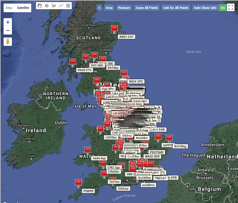
A better, or ‘flashier’ way, of displaying this data is by clicking the other button next to show on a map called ‘Export to Google Earth’.
This will download all of your data in a .KML file which Google Earth is capable of opening (other programs can open this file type but I recommend using Google Earth).
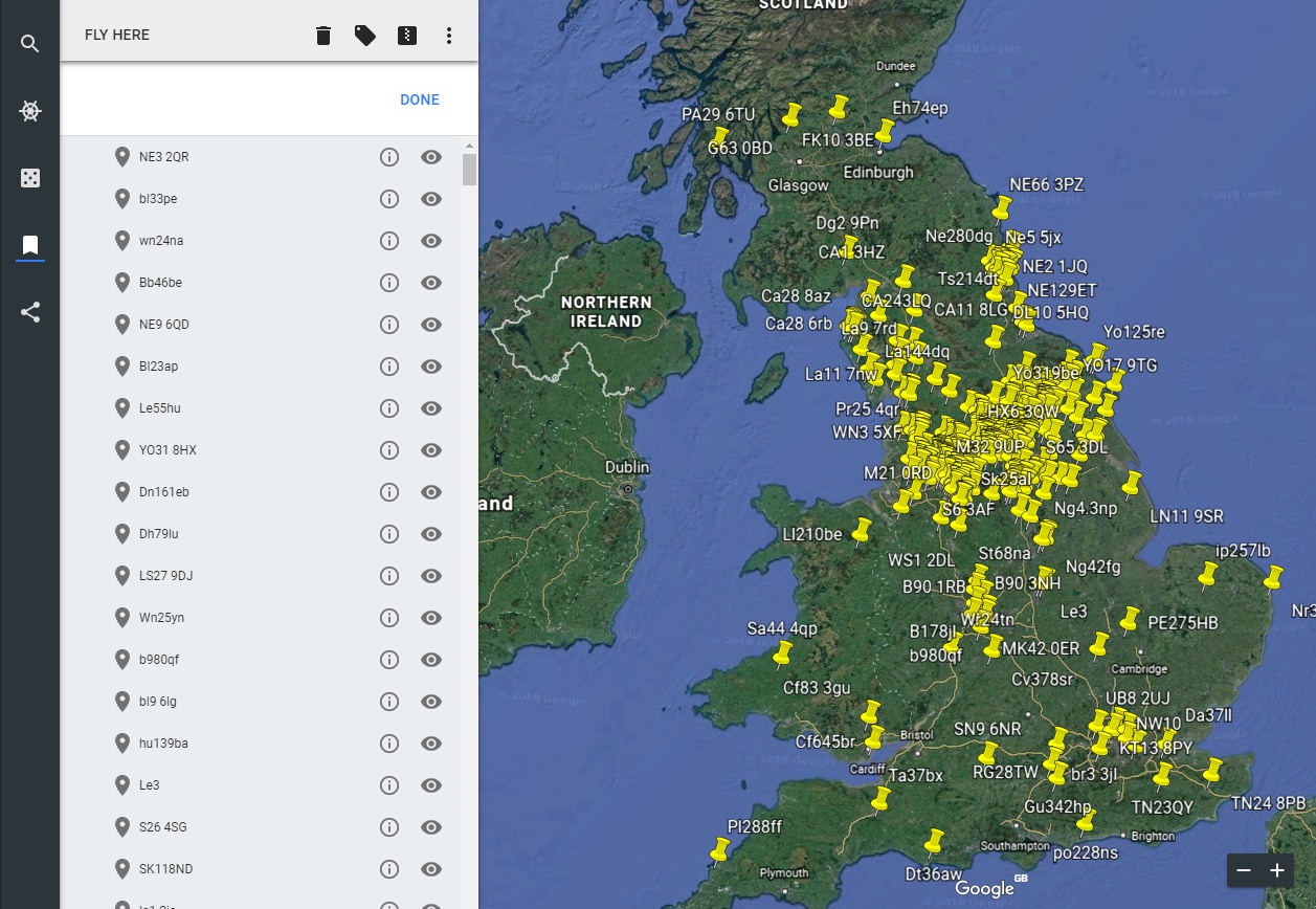
To import the .KML file go to Places > Import KML file and then this will plot all postcodes on the map with interactive pins that you can toggle on and off, zoom in and out, and share with other people.
MSOA Data
This is also worth a mention as you can identify local areas by average weekly income by using MSOA (Middle Layer Super Output Area), data and cross reference this with where your leads are coming from.
Conclusion
At the end of this process you will be left with a good idea of the physical areas that are converting the best for your website.
This can then lead to further investigations where you can questions why certain areas performing so well.
You can also investigate areas you want to be targeting are not converting.
Of course, the Google Venice algorithm plays a major role in local rankings, but this is still a nice activity that you can do to help better understand your geo demographic.